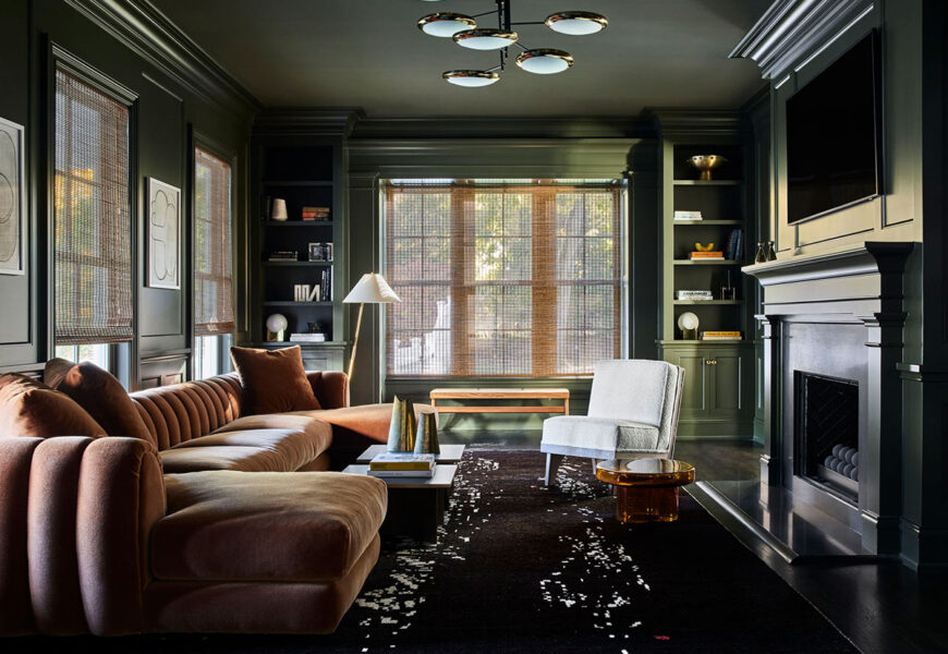
There’s a particular kind of room that stops you the moment you step inside. The lighting is low, the walls carry real depth, and the whole space feels like it’s pulling you in rather than pushing you out. That feeling — that quiet, almost physical sense of comfort — is exactly what a well-designed moody living room delivers. And right now, more people are actively seeking it out than at any point in recent memory.
If you’ve spent time saving dark, atmospheric interiors on Pinterest while sitting in a perfectly ordinary beige room, wondering why your space never quite gets there — this guide is for you. A moody living room isn’t about creating something dark for darkness’s sake. It’s about designing a space that genuinely feels like somewhere worth being.
What Exactly Is a Moody Living Room?
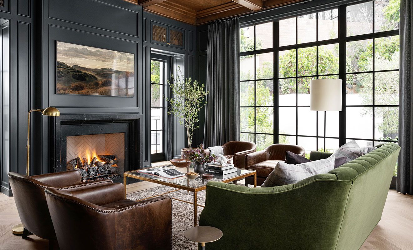
A moody living room is built around depth, atmosphere, and deliberate drama. The palette runs dark and saturated. The textures are layered. The lighting is warm and low, and the furniture feels grounded and substantial rather than light and temporary. The overall effect sits somewhere between a well-stocked private library and a quiet candlelit restaurant — intimate, considered, and quietly confident.
This design language has real historical roots. It draws from Victorian drawing rooms, the velvet-heavy interiors of Art Deco, and the rich material choices of mid-century modernism. What’s changed is the way it’s being interpreted today — lighter in spirit, more livable, and far more accessible than it once was. You don’t need high ceilings or period architecture to make it work. A modest apartment living room, approached with the right thinking, can carry this aesthetic just as powerfully as a grand townhouse.
The difference between a moody living room that feels magnetic and one that just feels heavy comes down to intention. Every choice — the paint color, the fabric, the placement of a lamp — needs to serve the same atmosphere. When those choices align, the result is genuinely striking.
Why People Are Moving Away From Bright Interiors
The prevailing design advice for decades was reliably the same: keep it light, keep it airy, add mirrors, let the natural light do the work. That guidance isn’t wrong, exactly. But it has produced an enormous number of rooms that feel safe, interchangeable, and a little forgettable.
There’s been a meaningful shift in recent years. Interior designers, homeowners, and the people who write about both have started moving toward darker, more atmospheric spaces — and the moody home aesthetic has moved well beyond trend territory into something more lasting. Part of what’s driving this is genuinely psychological. Environmental psychology research has shown, fairly consistently, that darker and warmer spaces tend to lower stress responses and help people feel more settled. There’s less visual stimulation, fewer reflective surfaces competing for attention, and a stronger sense of enclosure that many people find instinctively calming.
There’s also something more personal at work. A dramatic living room takes commitment. Dark walls and rich furnishings signal that someone made deliberate choices about how they wanted to live. That confidence reads clearly to anyone who enters the space, and it tends to leave a strong impression. Interior designer Justina Blakeney has spoken about moody interiors as a form of permission — giving yourself the right to be bold within your own home. That framing resonates for good reason.
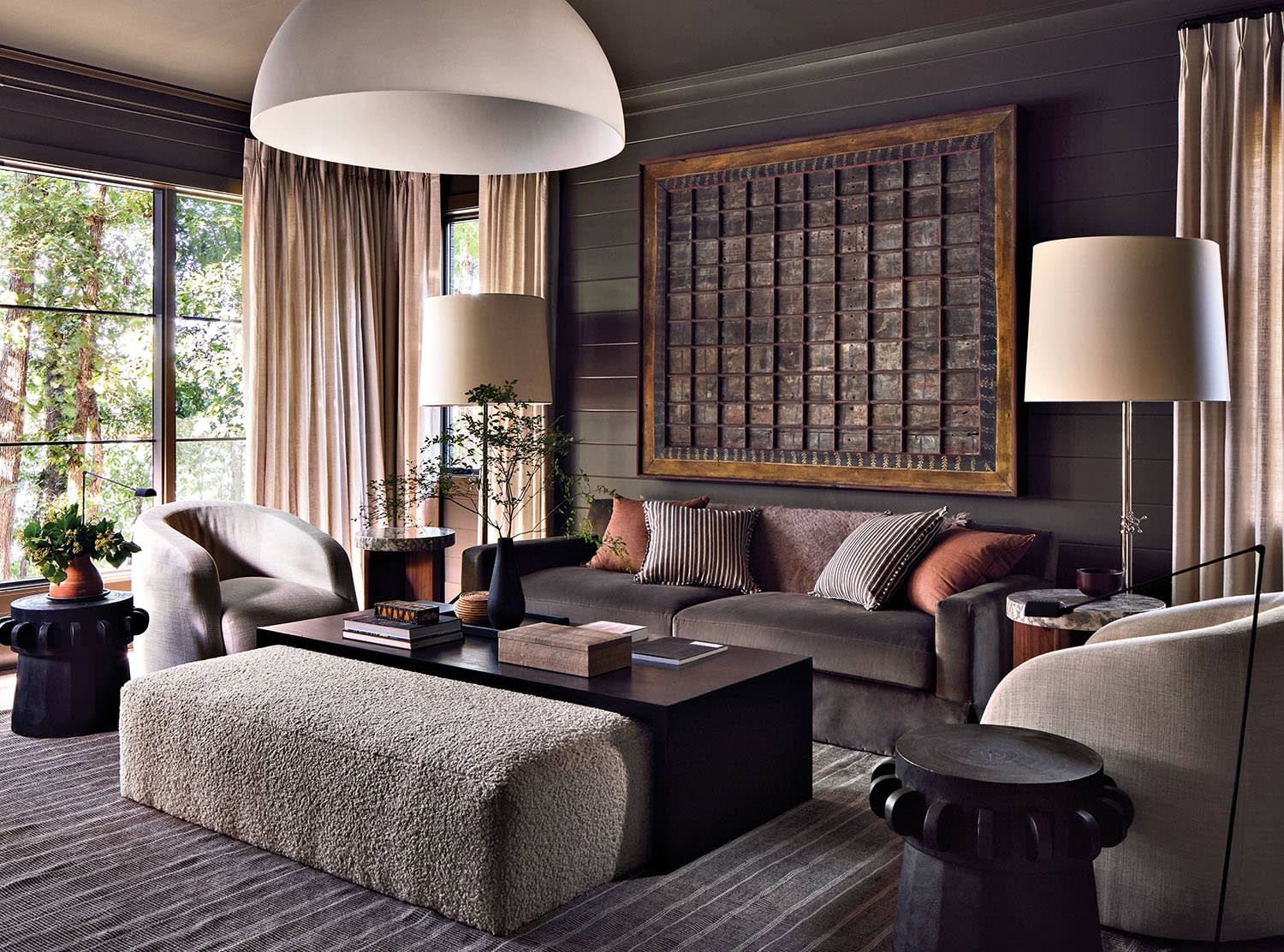
Choosing the Right Color Palette for Your Moody Living Room
Color is where the process either comes together or goes sideways. Most people who struggle with moody living room decor aren’t making bad decisions about furniture or lighting — they’re making uncertain decisions about color, and that uncertainty shows.
The Best Dark Wall Colors That Actually Work
The most reliable choices for dark wall colors in a moody living room right now are deep forest green, midnight navy, charcoal grey, dusty plum, and warm terracotta brown. Each carries a different atmosphere and suits different kinds of spaces.
Forest green is arguably the most livable of the group. Its connection to the natural world means it reads as organic rather than oppressive, even in rooms with limited natural light. Farrow & Ball’s Calke Green and Mizzle have become genuine cult favorites among interior designers for this reason, as has Benjamin Moore’s Black Forest Green. These aren’t trendy colors — they’re colors that hold up over time.
Navy blue walls bring structure and a certain quiet formality. Paired with brass hardware, warm leather, and natural wood, the result feels polished without being cold. Charcoal grey is the most forgiving entry point into this palette. It works with almost every accent color, doesn’t demand as much commitment as green or navy, and reads as sophisticated rather than heavy. For anyone new to the moody living room aesthetic, starting with charcoal is a genuinely practical place to begin.
Should You Paint the Ceiling Too?
The answer, with very few exceptions, is yes. One of the most common and most damaging mistakes people make when attempting a cozy dark room is stopping the color at the ceiling line. That decision cuts the atmosphere in half. Painting the ceiling in the same shade — or even one tone deeper — creates what designers describe as an enveloping effect. The room feels complete, deliberate, and fully formed rather than like a half-finished idea.
The concern that a dark ceiling will make a room feel smaller is understandable. Sometimes it does. But in a moody living room, that containment is usually an asset, not a problem. The goal is intimacy, not volume.
Lighting Is Everything in a Moody Living Room
If color is the foundation, lighting is what brings the whole thing to life. Poor lighting in a dark room doesn’t create atmosphere — it creates gloom. The distinction between the two is almost entirely a function of how the light is layered and where it comes from.
Layered Lighting: The Designer’s Secret
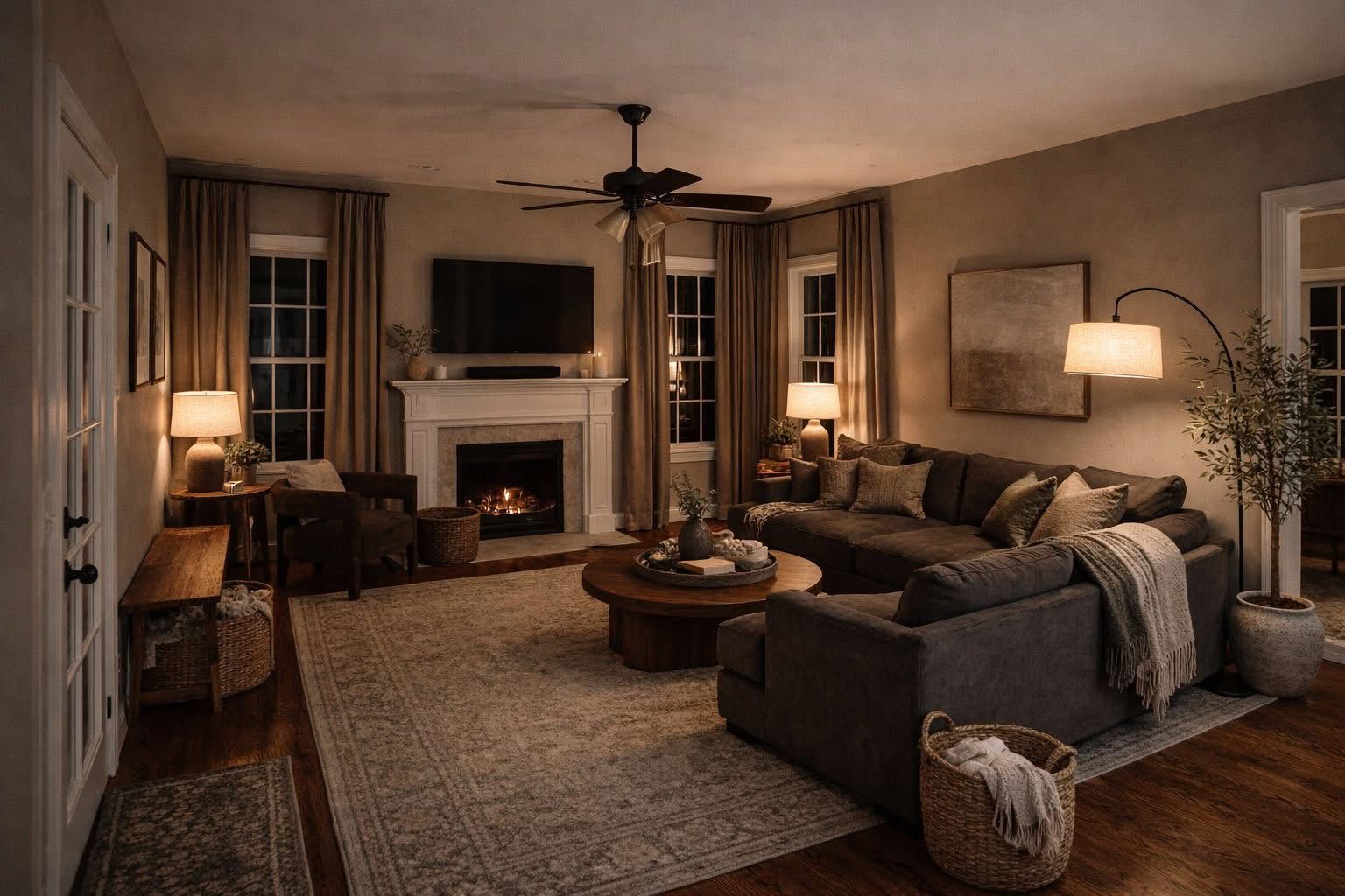
Layered lighting means using multiple sources at different heights and with different purposes, rather than relying on a single overhead fixture to do all the work. A well-lit moody living room typically works across three layers. The ambient layer — a central pendant or chandelier — provides overall illumination but stays dimmed. The accent layer — wall sconces, picture lights, uplighting placed behind or beneath furniture — creates the depth and shadow that give the room its atmosphere. The task layer — a reading lamp, a table lamp — provides contained, purposeful light exactly where it’s needed.
Candles earn a place in this system too. Not as a replacement for electric light, but as a supplement. A cluster of candles at varying heights, placed on a coffee table or grouped on a shelf, adds a quality of warmth and movement that electric light doesn’t quite replicate.
Bulb Temperature Matters More Than You Think
For a moody living room, keep bulbs in the 2200K to 2700K range — classified as warm white or extra warm white. Moving beyond 3000K shifts the light toward cooler, bluer tones that work directly against dark wall colors and strip the room of warmth. If you’ve ever set up a dark interior that felt almost right but somehow off, cool-temperature bulbs are often the explanation.
Furniture and Texture — Building the Layered Look
A moody living room isn’t achieved through color alone. The physical feel of the space matters enormously. Texture is what separates a dark room that feels rich from one that feels flat.
Fabrics That Define the Moody Aesthetic
Velvet is the defining fabric of this interior style. It absorbs light rather than bouncing it back, which adds genuine depth to the room’s overall palette. A deep teal or burgundy velvet sofa against a dark wall is one of those combinations that looks exceptional in photographs and feels even better in person.
Beyond velvet, there are several other textures worth layering in. Linen in muted, earthy tones adds softness and visual quiet. Boucle brings a tactile roughness that contrasts well with smoother surfaces. Aged or cognac leather reads as warm and grounded — a natural companion to moody color schemes. Wool throws and chunky-knit textiles add what might be called the “settle in and stay” quality that sits at the heart of this aesthetic.
Mixing textures within the same color family is one of the most effective techniques in this style. A charcoal sofa alongside a charcoal velvet cushion and a charcoal linen throw sounds repetitive in theory. In practice, it creates a layered, visually complex surface that holds the eye.
Furniture Silhouettes That Work Best
Low-profile, substantial furniture tends to serve a moody living room better than tall, narrow, or visually lightweight pieces. Deep sofas with low backs, chunky coffee tables in dark wood or matte black, and generously filled bookshelves all contribute to the visual weight and presence that this style depends on.
Vintage and antique pieces work particularly well in this context. An old leather armchair, a reclaimed wood side table, a mid-century credenza — these objects bring a sense of accumulated history to a space that benefits greatly from it.
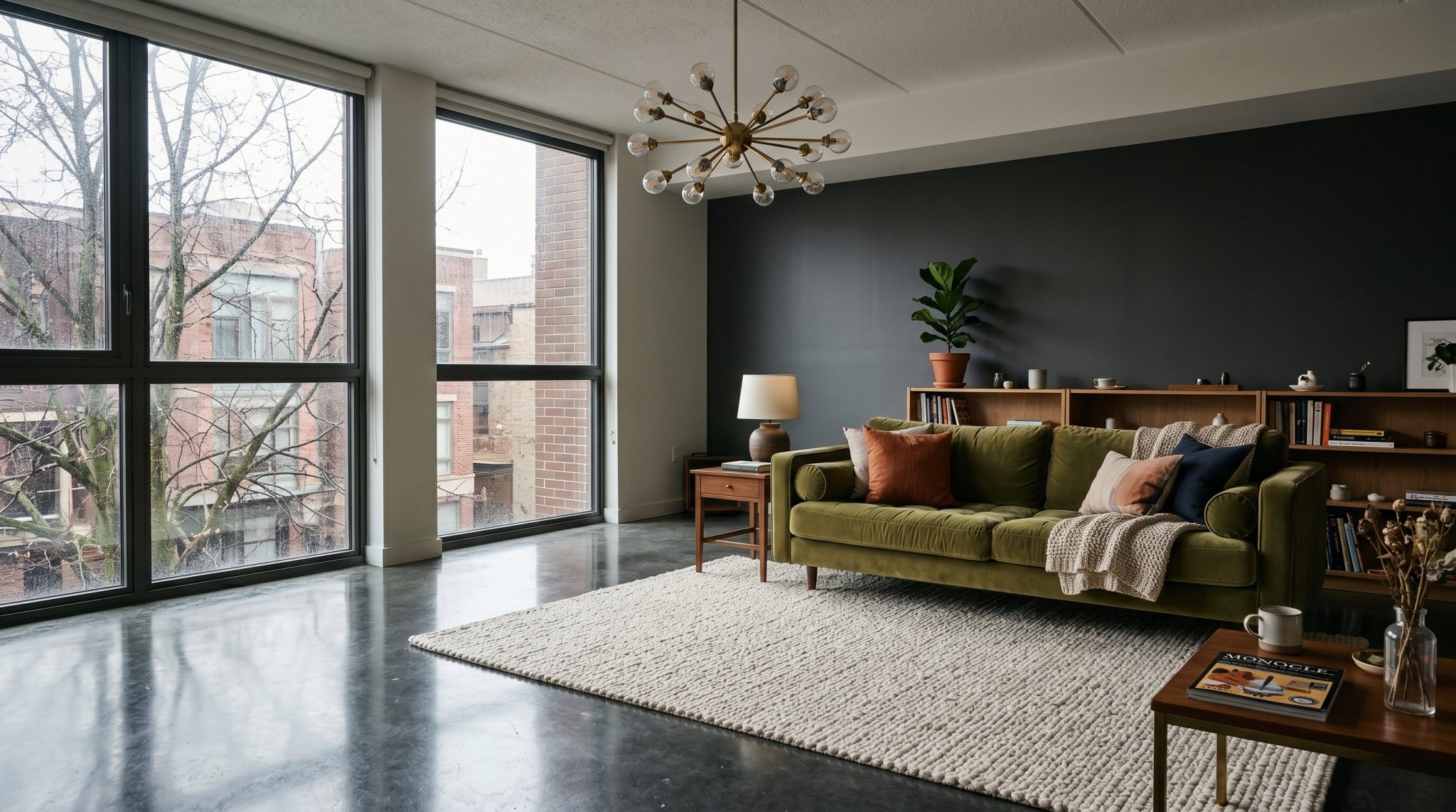
Styling Details That Make or Break a Moody Living Room
| Element | What Works | What to Avoid |
|---|---|---|
| Art | Large scale, dark frames, abstract or atmospheric subjects | Bright pop art, white frames, generic prints |
| Plants | Dark-leaf varieties — ZZ plant, rubber plant, fiddle leaf fig | Too many small pots scattered without intention |
| Rugs | Deep jewel tones, Persian patterns, dark neutrals | Light beige or white rugs that break the palette |
| Books | Grouped by color, displayed on open shelves | Hidden away entirely or too sparse to register |
| Mirrors | Aged brass or black frames, positioned to reflect light sources | Large plain frameless mirrors that feel incongruous |
| Candles | Grouped in clusters at varied heights | Single candles placed without visual purpose |
The Art of Intentional Density
Moody living rooms are not minimalist spaces. They belong to a maximalist sensibility, but a considered one. Bookshelves that are genuinely full. Collections of interesting objects arranged on side tables. Art layered against a wall rather than isolated on it. This approach is sometimes described as “collected” style — it gives the impression that the room has been built gradually over years, through real choices and real experiences, rather than assembled in a single afternoon from one source.
The risk on either end is real. A dark room with too little in it feels cold and uninviting. A dark room with too much feels chaotic. The goal is intentional density — enough to feel layered and lived-in, with nothing present purely by default.
Plants in a Moody Living Room
Plants bring a living quality to dark interiors that no object can replicate, but the choice of variety matters. Bright, variegated plants tend to work against the palette rather than with it. The better options are darker-leafed species: the ZZ plant with its deep, waxy green foliage, the dark burgundy rubber plant, or a large fiddle leaf fig. These add organic life without disrupting the color story the rest of the room is telling.
Small Space? Here’s How to Pull Off a Moody Living Room Without It Feeling Like a Cave
The most common concern people raise about going dark is that it will make a small room feel suffocating. It’s a reasonable worry, but it’s also one that gets disproven fairly regularly when the approach is right. A small moody living room, thoughtfully handled, doesn’t feel claustrophobic — it feels intentionally intimate. Those are very different experiences.
A few techniques make this consistently achievable. One well-chosen mirror — dark or aged brass frame, positioned where it catches window light — adds perceived depth without pulling against the palette. Keeping furniture low and pushed slightly away from walls creates breathing room at eye level. If four fully dark walls feel like too much, a single deeply colored accent wall can carry the atmosphere without the full visual weight.
Consider a real-world example: a 14-by-16-foot London flat living room, painted from floor to ceiling in Farrow & Ball’s Railings — a near-black navy — including the ceiling. A single brass pendant. A forest green velvet sofa. A Persian rug in deep reds and blues. Every design publication that covered it described the space as surprisingly open and genuinely atmospheric. The darkness gave the room definition. It didn’t diminish it.
Common Mistakes That Ruin a Moody Living Room
Even well-intentioned dark room design can go wrong in a few predictable ways. The most frequent issue is using multiple competing dark colors without a unifying anchor. Dark green walls, a dark purple sofa, dark navy cushions, and dark brown floors don’t read as layered — they read as muddy. There’s no visual hierarchy and the eye has nowhere to settle.
Neglecting natural light is another consistent problem. A moody living room during daylight hours still needs to feel purposeful. Heavy linen curtains in a complementary dark neutral can filter natural light beautifully rather than simply blocking it out.
Furniture that’s too similar in scale produces a flat, uninteresting composition regardless of how strong the color palette is. Vary the heights deliberately. A tall bookshelf alongside a low sofa. A sculptural floor lamp next to a low side table. These contrasts create visual movement.
And then there’s the most overlooked mistake of all — skipping the textiles. Dark walls without soft furnishings don’t create a moody living room. They create an empty room with dark walls. The warmth lives in the layers.
Frequently Asked Questions About Moody Living Rooms
What colors make a living room look moody?
Deep greens, navy blues, charcoal greys, dusty mauves, and rich terracotta browns are the most reliable choices. The common thread is undertone — colors with grey or brown bases feel grounded rather than garish, which is what separates a genuinely atmospheric space from one that simply feels dark.
Can a moody living room work in a small space?
Yes, and often quite well. The right lighting, low-profile furniture, and at least one reflective element — a well-framed mirror, for instance — go a long way. Smaller rooms can actually benefit from the dark treatment because it removes the awkward visual ambiguity of trying to make a modest space feel larger than it is.
How do I add warmth to a dark living room?
Layered warm-toned lighting in the 2200K to 2700K range is the fastest fix. Beyond that, natural materials — wood, leather, woven textiles — and warm accent colors like rust, cognac, or ochre add considerable warmth without requiring any changes to the wall color.
Is a moody living room hard to maintain?
Less so than most people expect. Dark walls are actually more forgiving of everyday scuffs and dust than light ones. The main area of attention is dark velvet and similar fabrics, where surface dust is more visible and requires more regular care.
What lighting works best in a moody living room?
Multiple layered sources — a dimmed central pendant, wall sconces, and at least one table or floor lamp — all fitted with warm white bulbs. A single overhead light as the sole source is the fastest way to make a dark room feel wrong rather than atmospheric.
Conclusion: Your Moody Living Room Is One Considered Decision Away
Most people who hesitate before committing to a moody living room are held back by the same thing — a reasonable fear of getting it wrong. Dark walls feel permanent. Rich furnishings feel like a risk. The worry that the whole thing might tip from atmospheric into depressing is real, and it keeps a lot of genuinely beautiful spaces from ever existing.
But here’s what holds true: the rooms that stay with you, the ones you remember long after leaving them, are almost never the cautious ones. A moody living room rewards commitment. It rewards careful layering, considered texture, and lighting that’s been thought through rather than defaulted to. In return, it gives you a space that feels genuinely different from every other room you’ve been in — one that has depth, warmth, and a quiet character all its own.
Start with a single decision. A wall color. A sofa. A rug that anchors the palette. Build carefully from there. And when someone walks into your living room and pauses — just for a moment — before saying anything at all, you’ll know the room is doing exactly what it was designed to do.